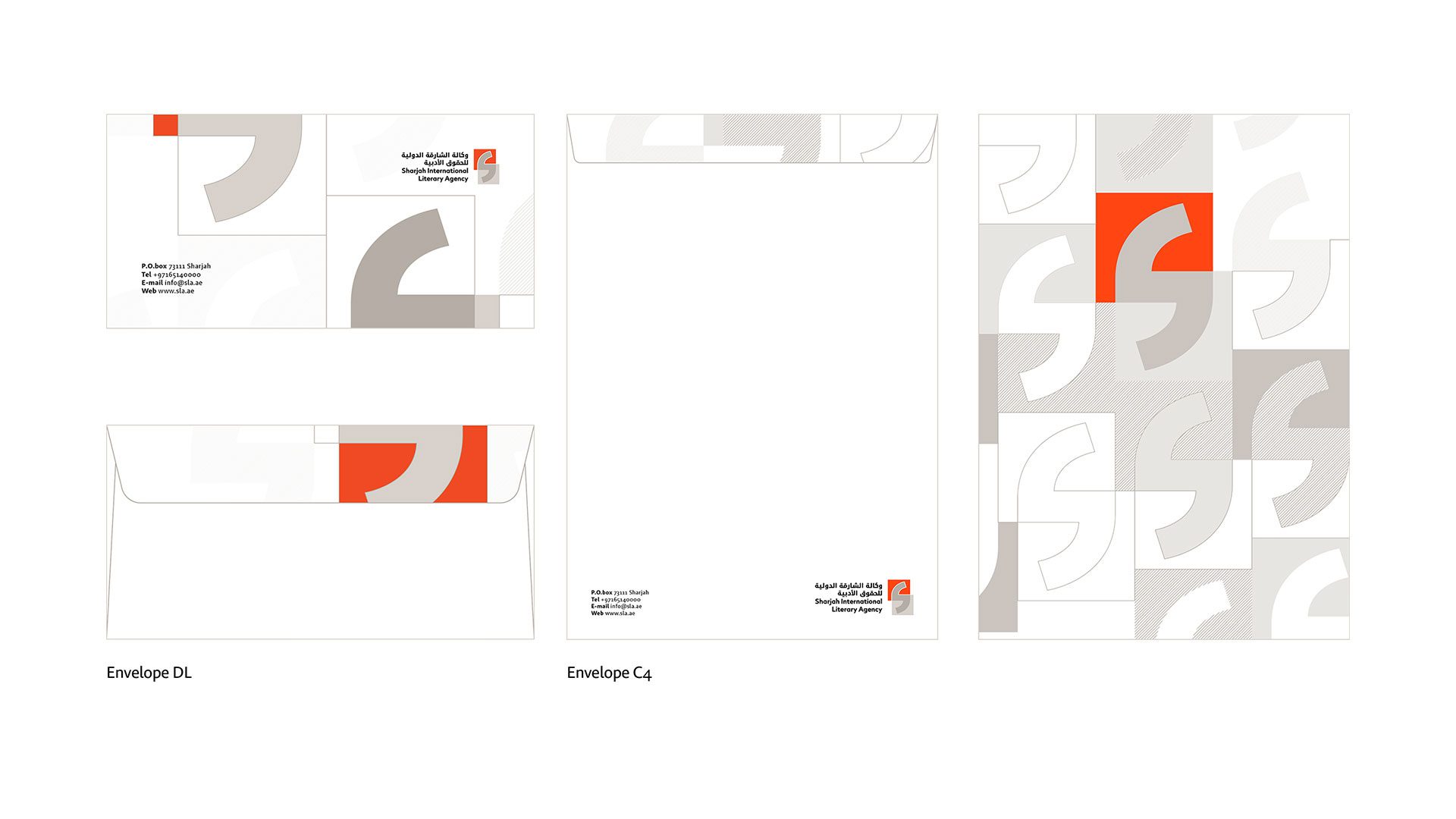
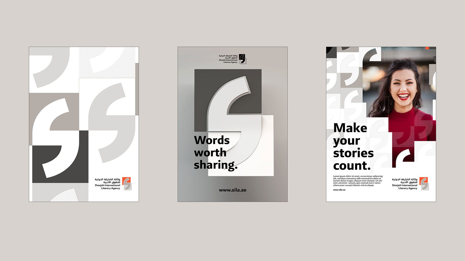
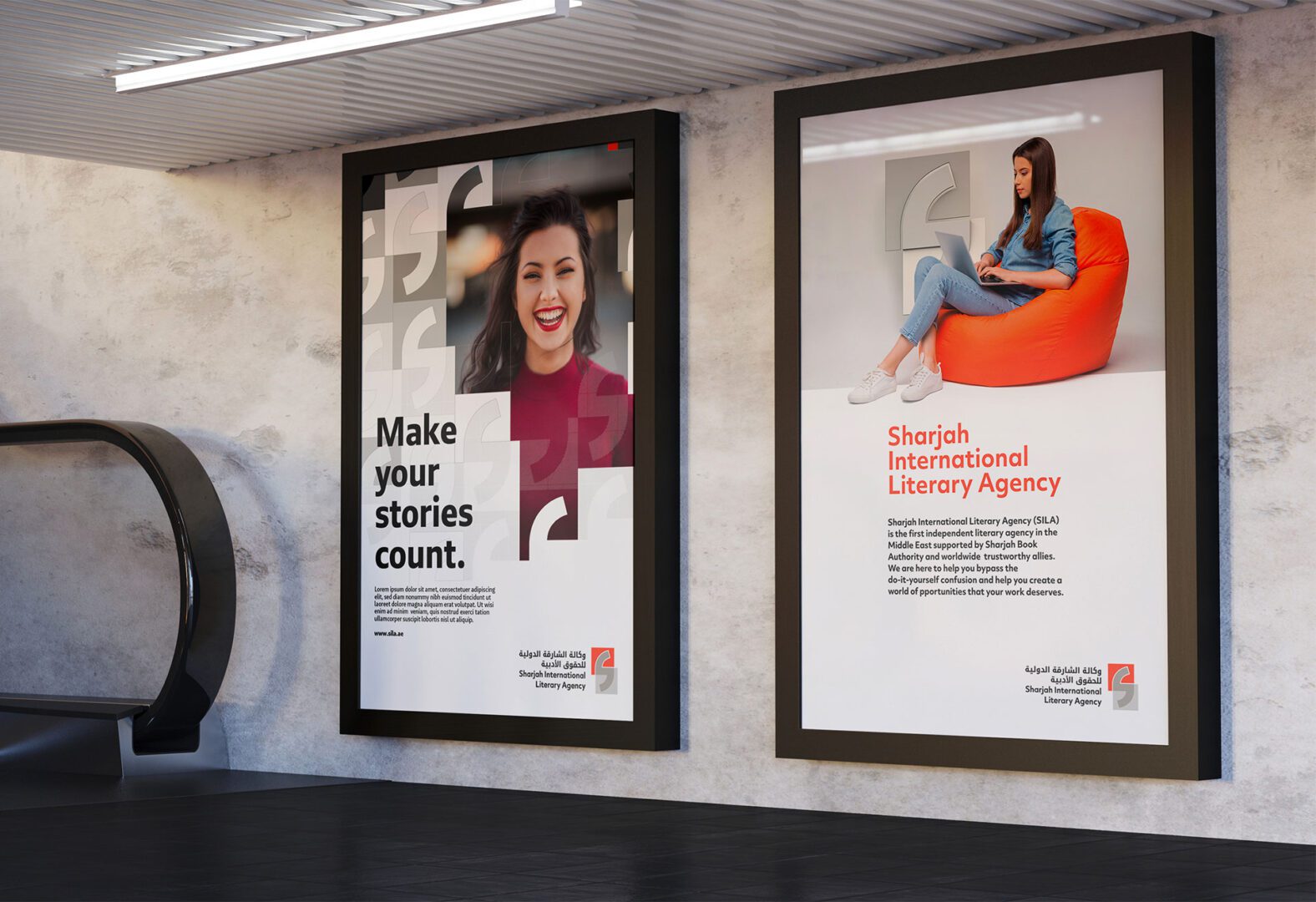
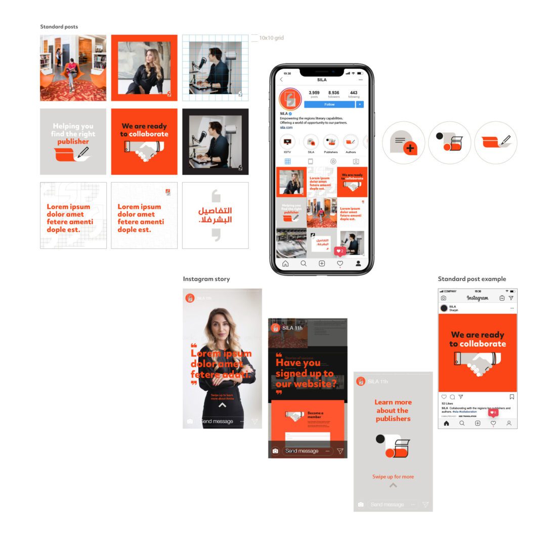
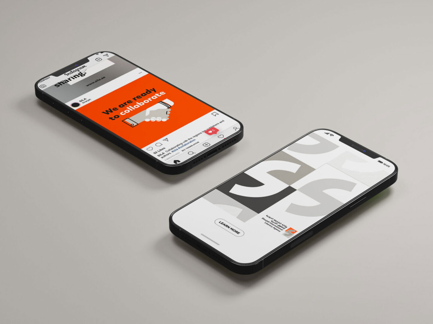
From brand strategy to design identity and a comprehensive pack of graphic design templates, we created an inspiring and rich narrative that helped them position their brand as the intersection of authors and publishers, art and business, English and Arabic.
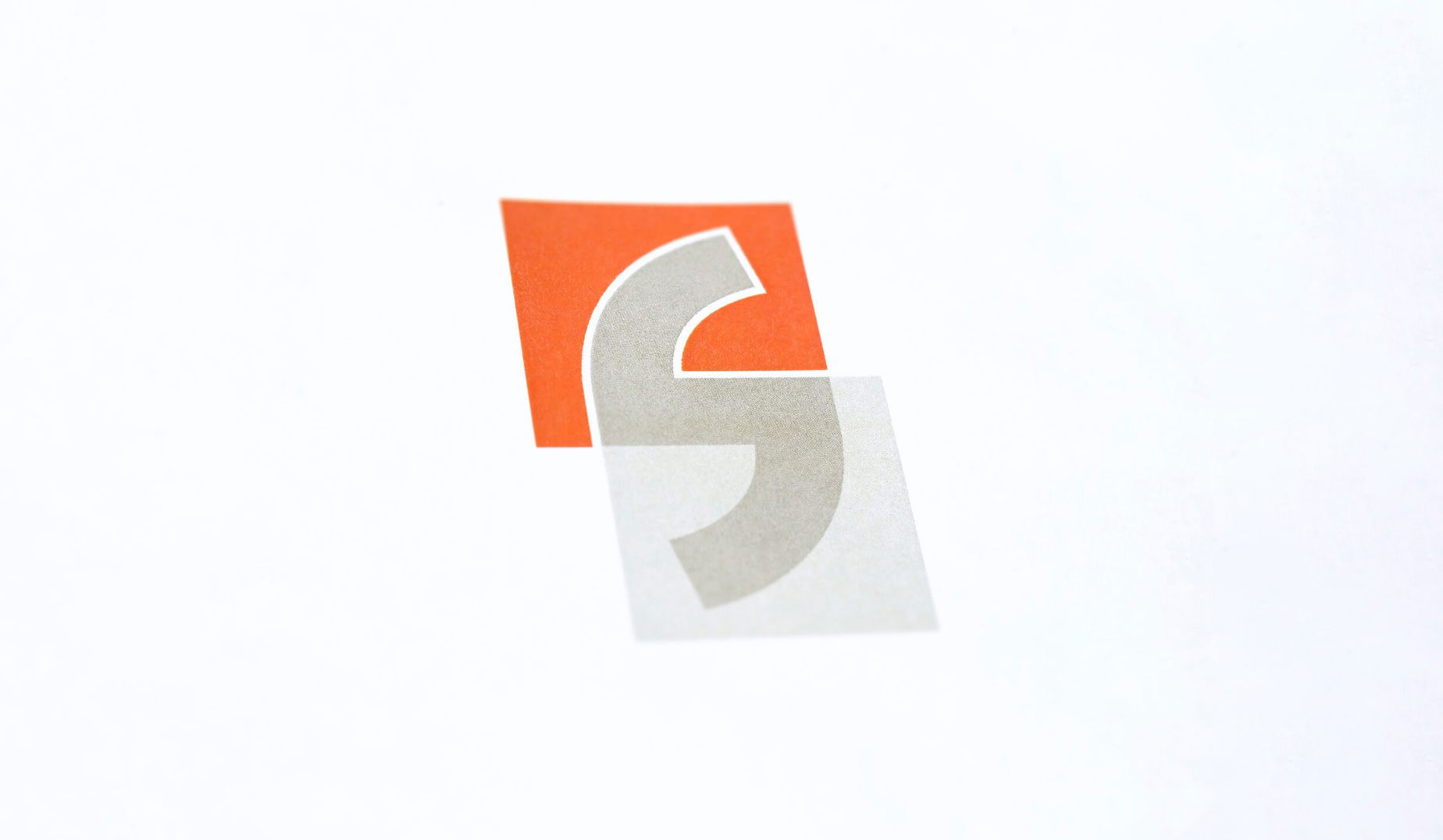
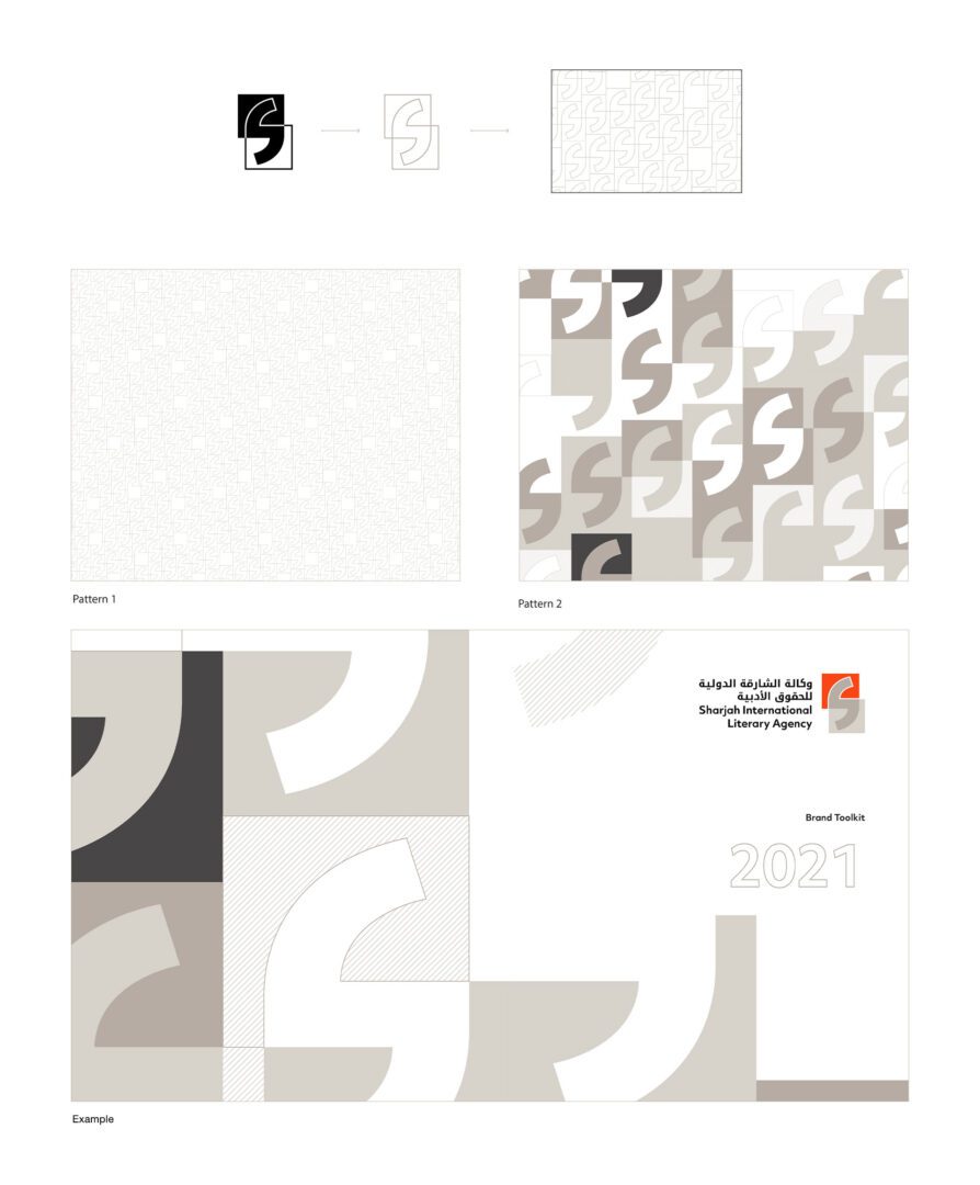
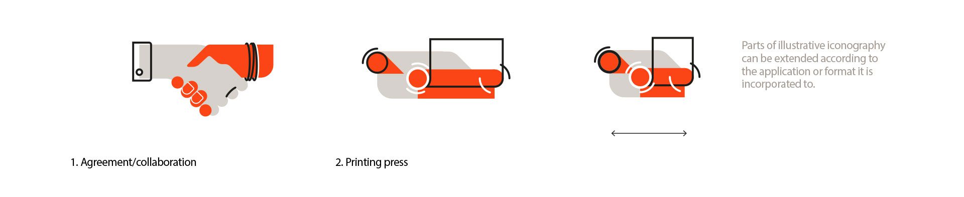
Shaped from quotation marks to represent how it carries the author’s story. Its neutral grey colours are a gesture of transparency that stands for trust and helps the orange stand out as a reminder of SBA.
SILA is now a strategically grounded brand positioned as a powerful new voice in the regional publishing landscape.