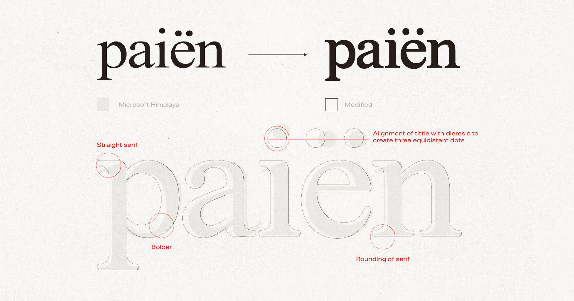
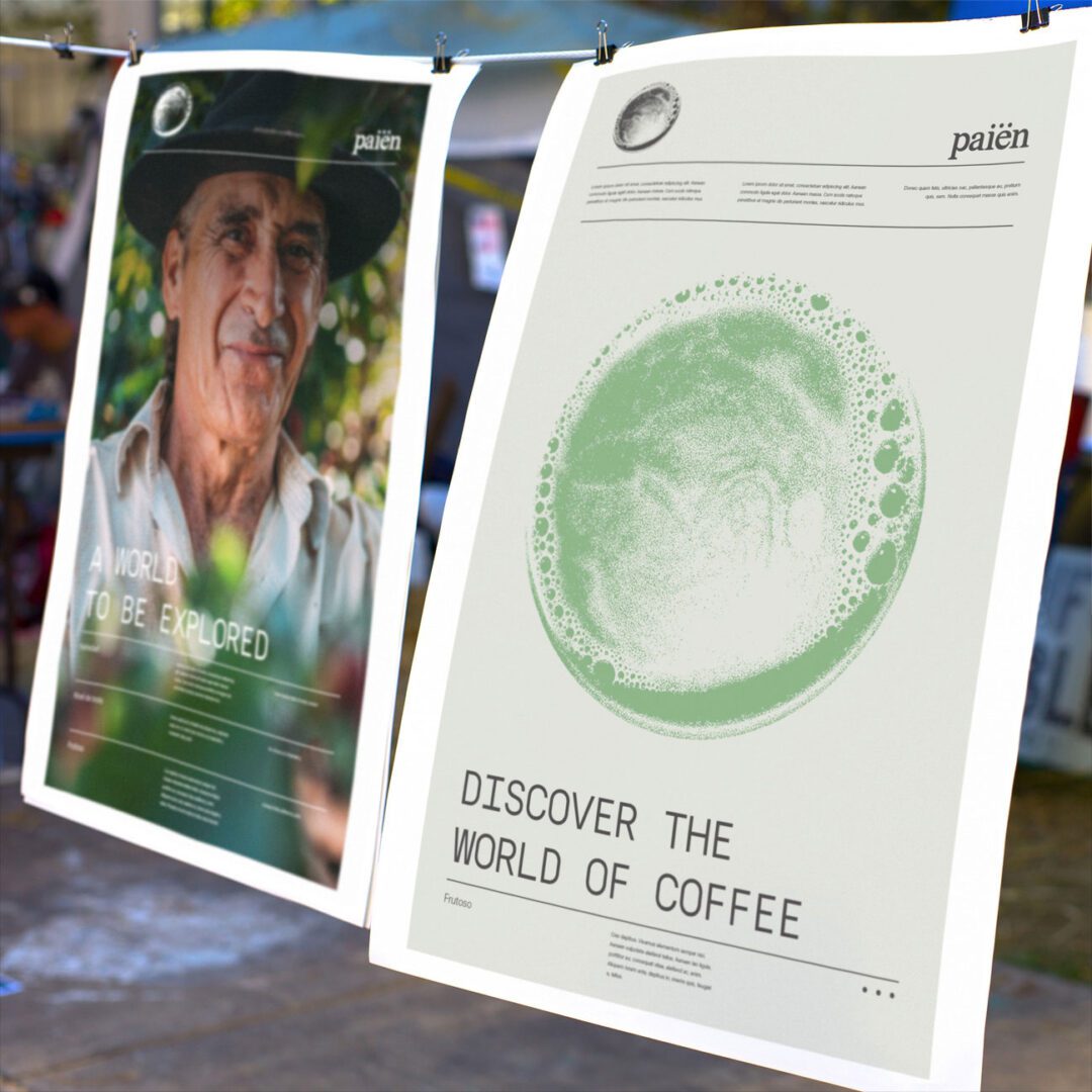
Paiën roasts and distributes coffee out of Barcelona, built on one idea: the coffee most people know is a fraction of what coffee actually is. The brief was to get that across without turning into a lecture, in a brand that could keep growing every time Paiën found a new origin or process worth representing.
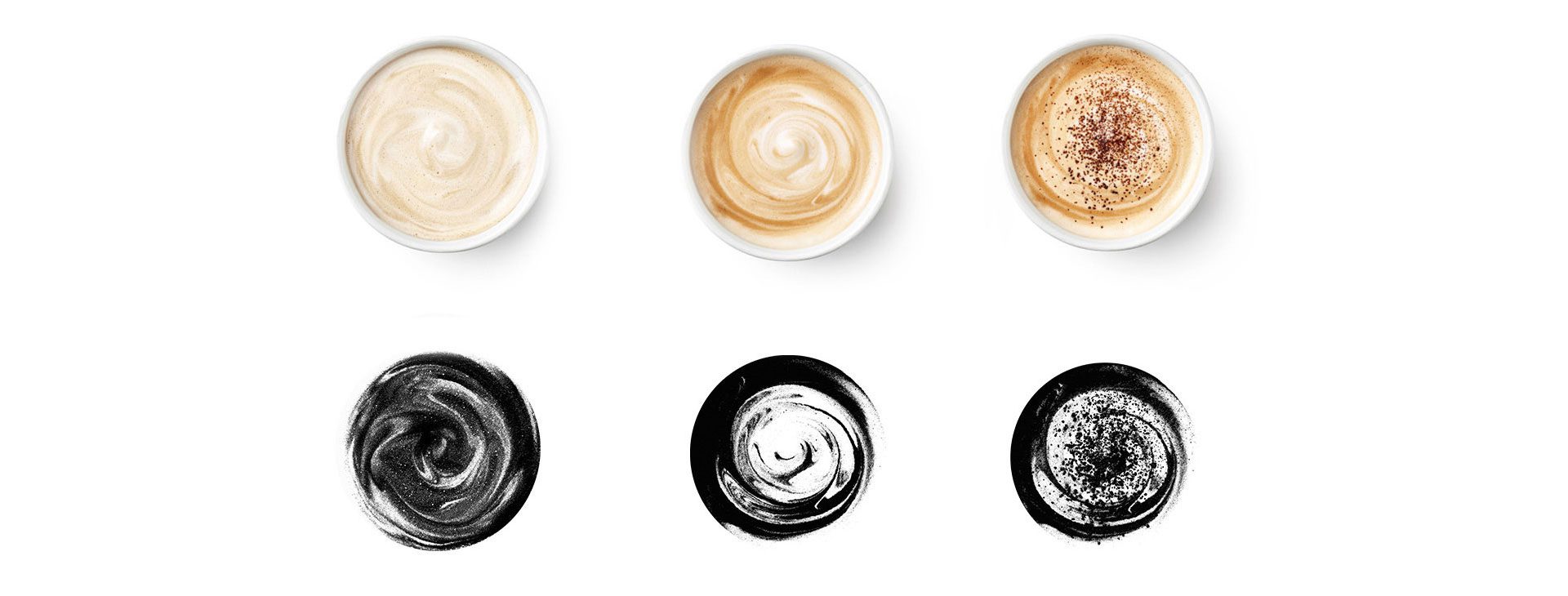
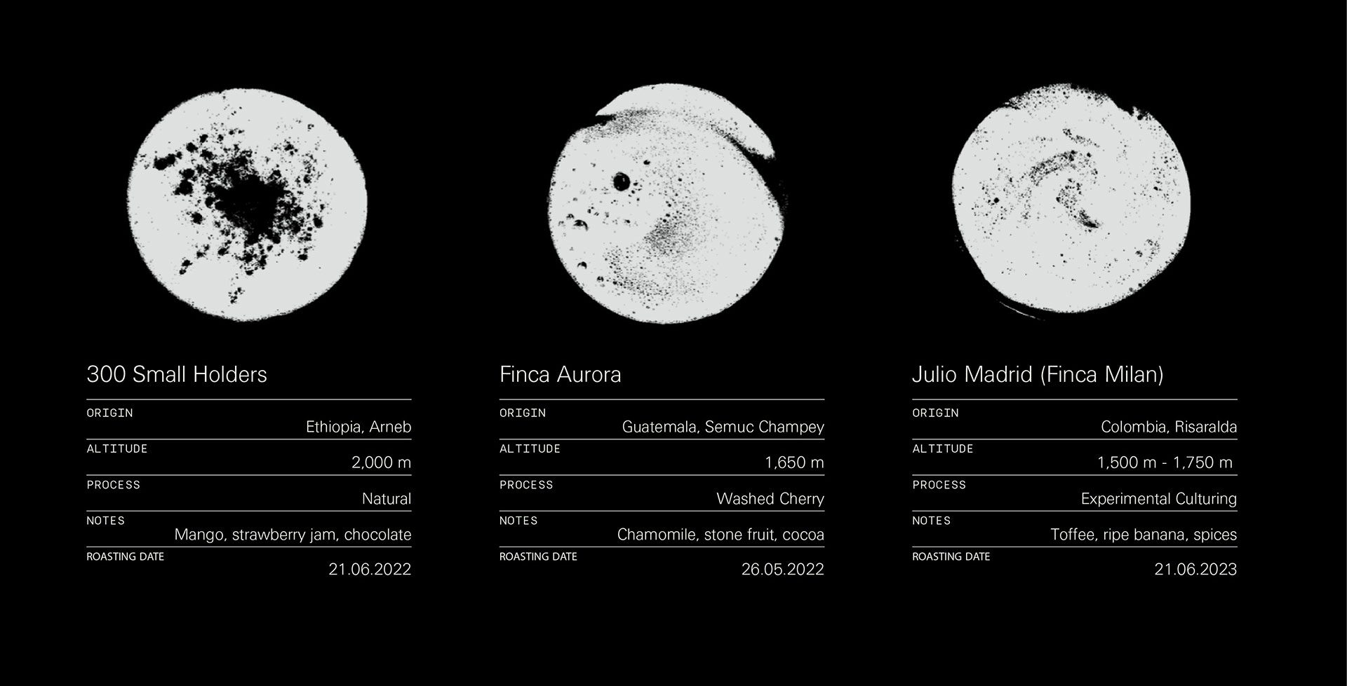
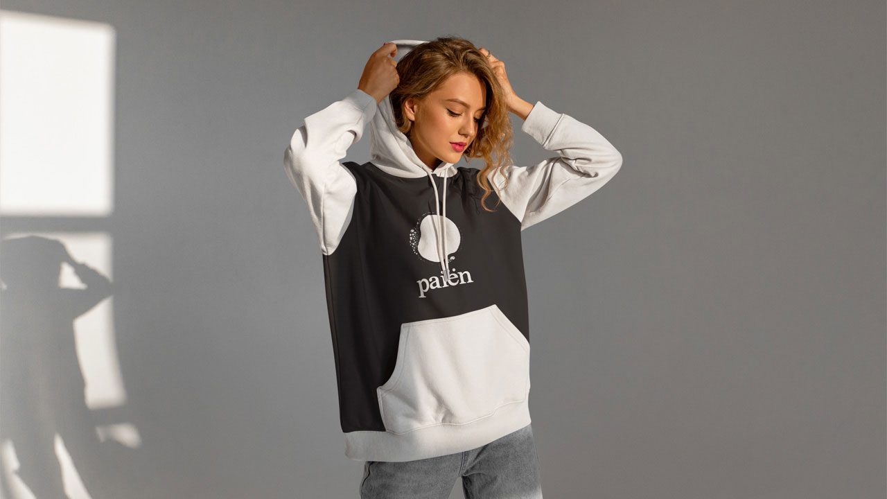
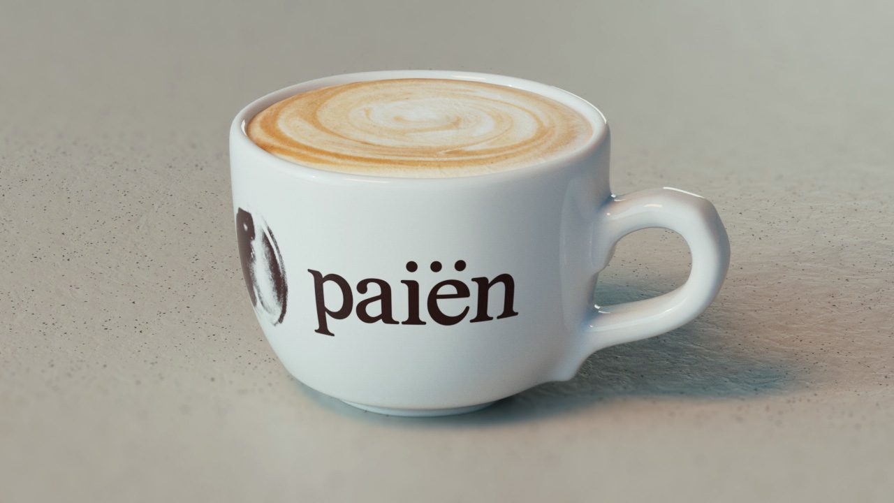
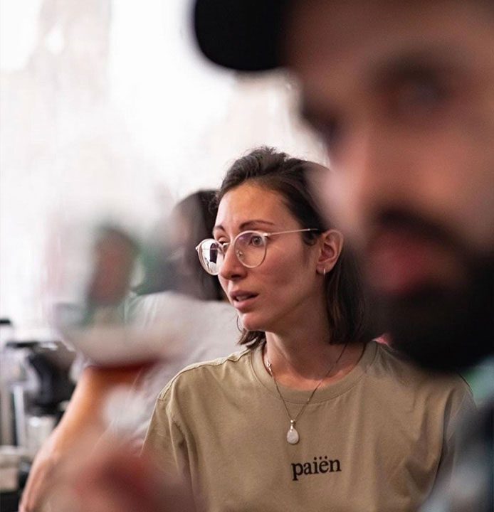
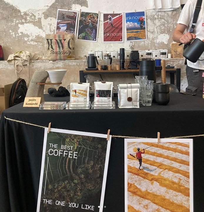
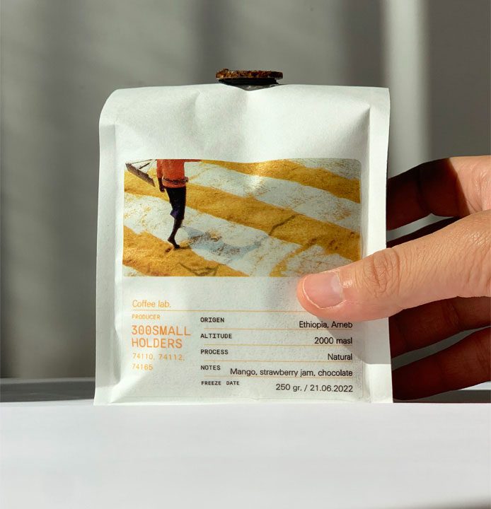
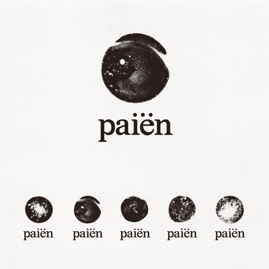
The fix was a modular isotype system instead of one fixed symbol. We built an isotype generator that produces a distinct mark for every “coffee world,” so each origin, roast or process gets its own visual identity while still reading instantly as Paiën, across packaging, merch, pop-up stands and social.
That system is what lets the brand scale the way Paiën’s own sourcing does: one world added at a time, each one distinct, all of them clearly the same brand. The packaging went on to win awards, and gave Paiën a visual language that keeps working as they add new farmers and origins, instead of one that needs a redesign every time they grow.