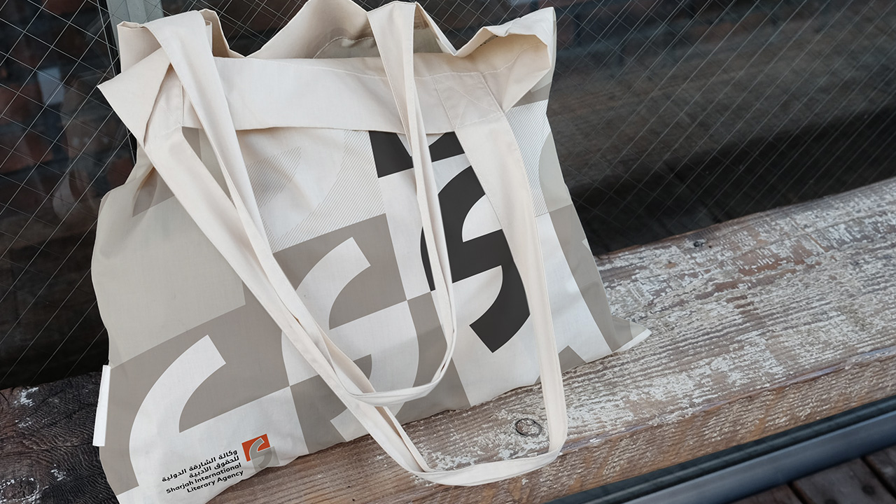
SILA
Client: Sharjah Book Authority
Project lead: Froy F. Castañeda
Creative/Art Direction: Diego R. Wikander
Brand Strategy: Lorena Lumbaque
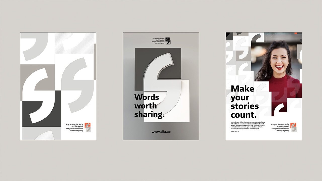
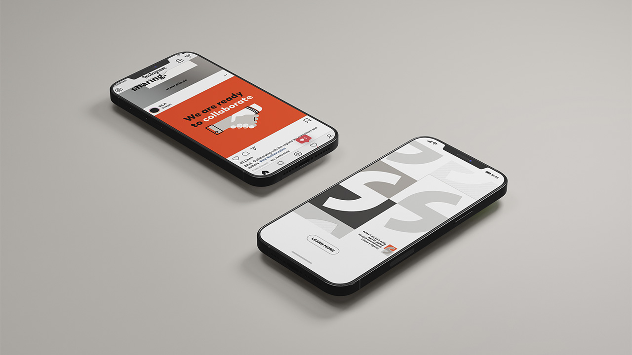
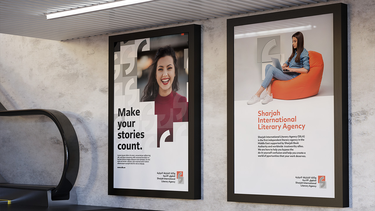
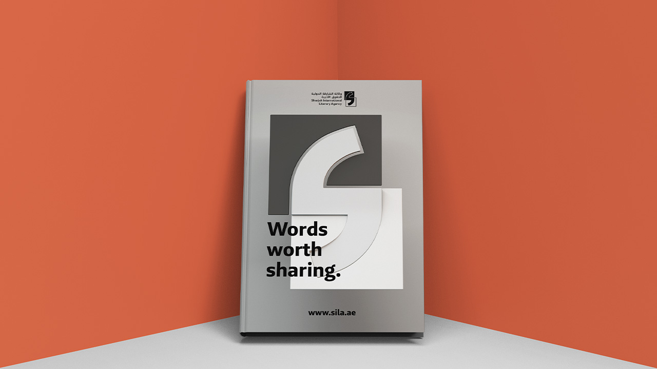
SBA (Sharjah Book Authority) needed to create a brand for SILA (Sharjah International Literary Agency), a first of its kind in UAE and the Middle East. Its goal is to represent publishers and authors regionally. From brand strategy to design identity and a comprehensive pack of graphic design templates, we created an inspiring and rich narrative that helped them position their brand as the intersection of authors and publishers, art and business, English and Arabic.
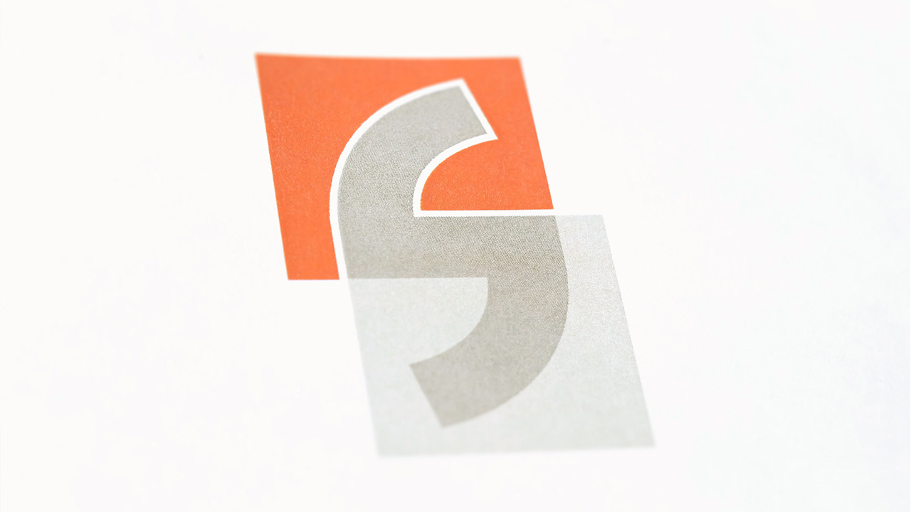
SILA is at the intersection of authors and publishers, art and business, English and Arabic. Shaped from quotation marks to represent how it carries the author's story where it can speak for itself without risks. Its neutral grey colors are a gesture of transparency that stands for trust and helps the orange stand out as reminder of SBA.