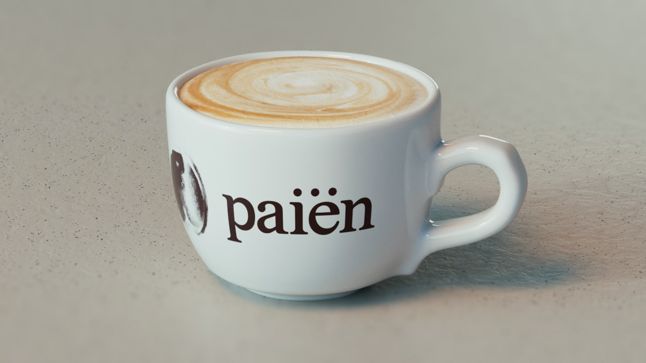
Paiën
Client: Paiën
Brand Strategy: Lorena Lumbaque
Creative Director: Diego R Wikander
Senior Brand Designer: Gustavo Rojas
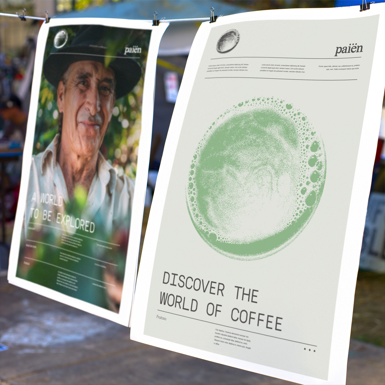
Coffee has more than one way to make it, grind it, roast it, and taste it. This brand is all about exploring each of them and finding your favorite.
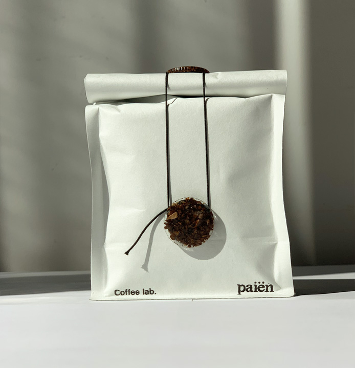
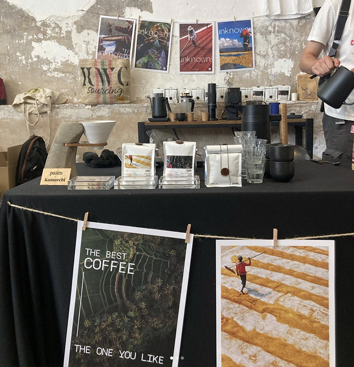
Paiën is a Coffee roaster and distributor from Barcelona that believes the world of coffee is not limited to the one you know.
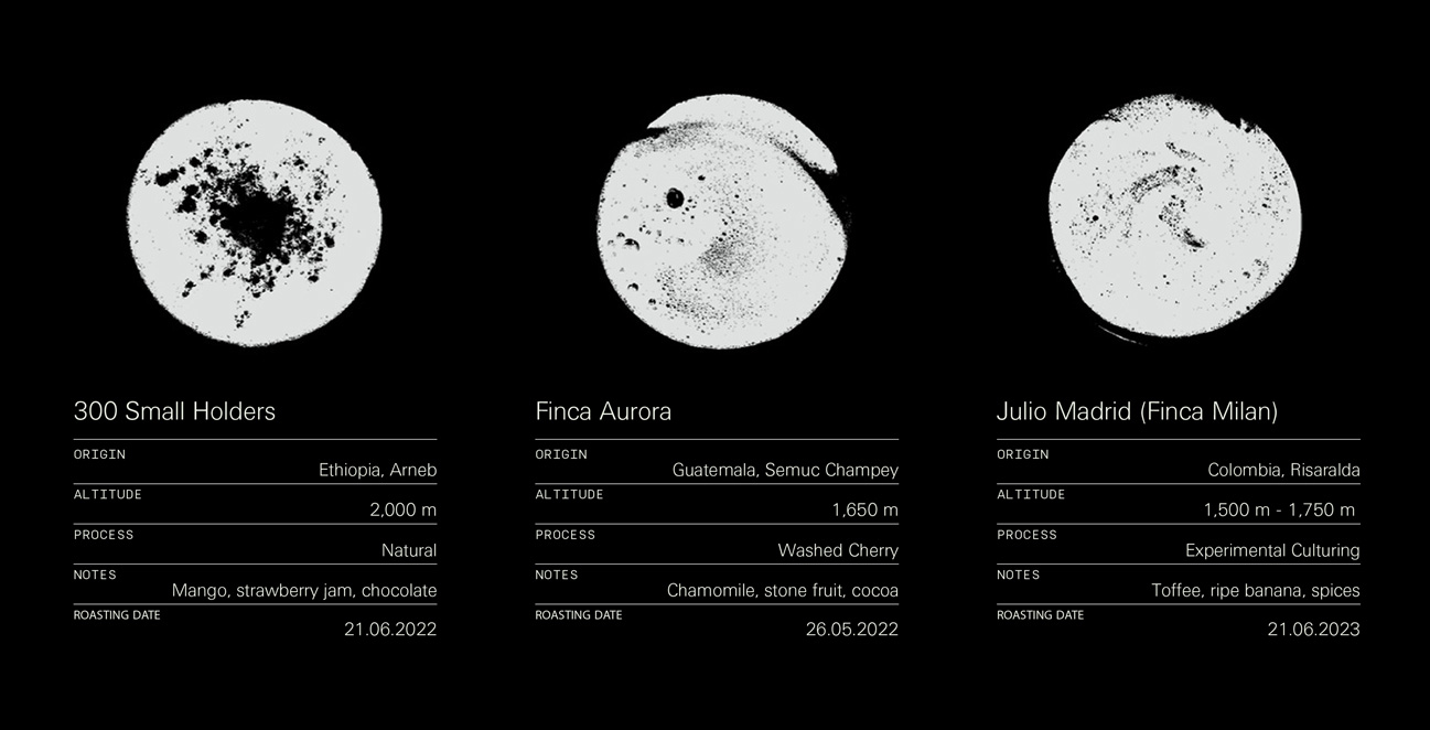
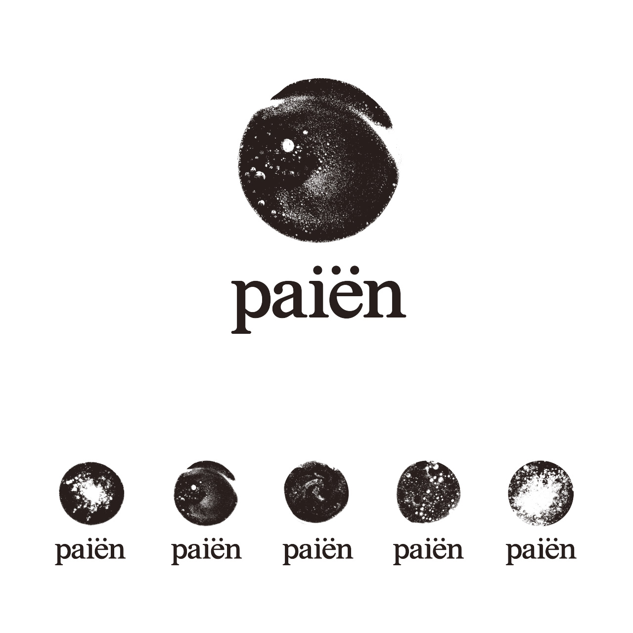
They say "there's so much more than the same coffee we always order, or the one we make at home". With them we can enjoy everything that coffee has to offer. Like a portal to an abundant universe where each coffee becomes an entire world to explore. Hence the brand identity features an isotype that represents one world at a time.
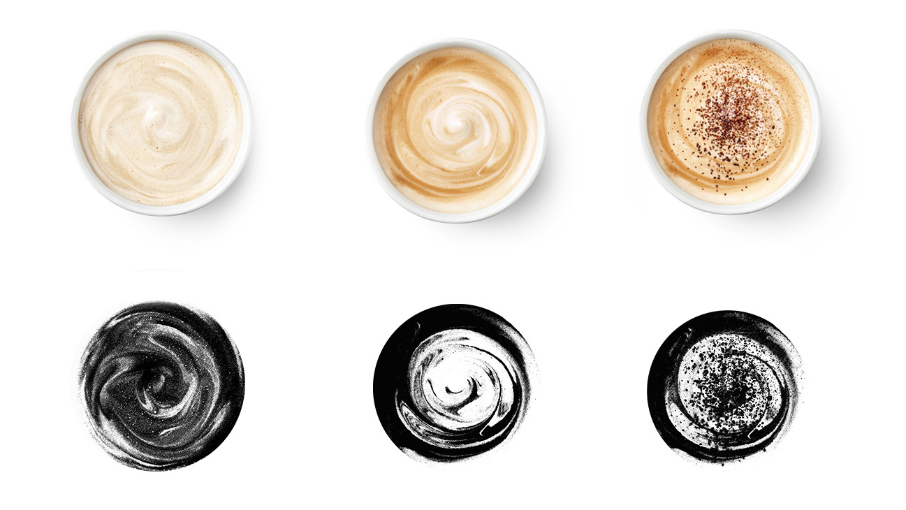
To ensure their craggy logo had no issues when rolling it out, we created an "isotype generator", a system with a set of files that allowed them to generate automatically all versions of their brand identity ready to be applied across all platforms.
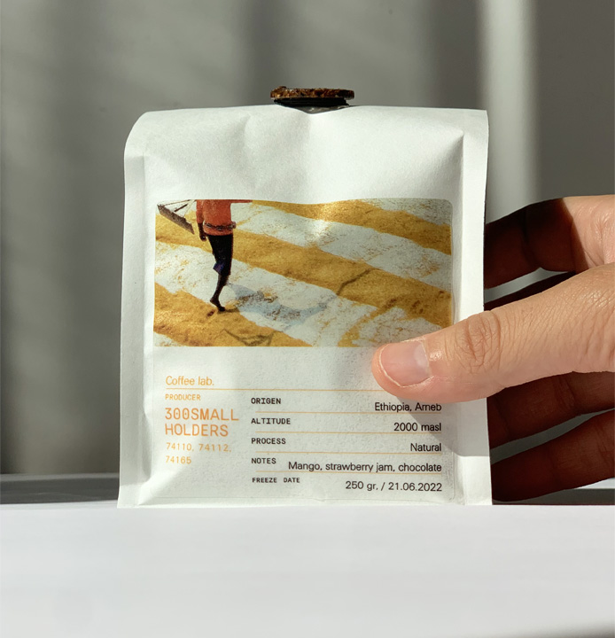
The brand aimed to stay true to their "suppliers transparency policy" by giving a voice to the farmers who work hard to make their beans the very best.